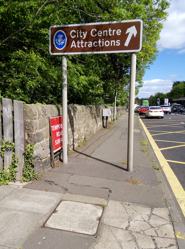
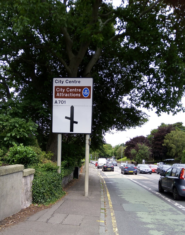
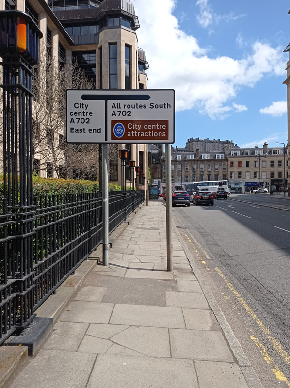
However, what is *on* these signs deserves a closer look. Many massive signs convey very simple information which is either not needed, or could be communicated much more simply. A favourite of mine is the brown “City Centre Attractions” tourist signs like this one on Queensferry Road. Pretty much every visitor to Edinburgh knows that most of its ‘attractions’ are in the city centre, so why the need for these giant two-pole signs? (Edinburgh’s excellent Street Design Guidance, by the way has a presumption against double poles - unfortunately, like much else in the SDG, all too often ignored by the council itself). In Spain or France, these would be replaced by a more modest but equally effective ‘Centro Ciudad’ or ‘Centre Ville’.
(1) https://www.saga.co.uk/magazine/motoring/cars/accessories/how-do-sat-navs-work
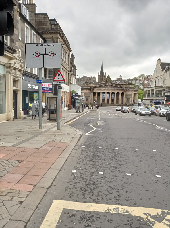
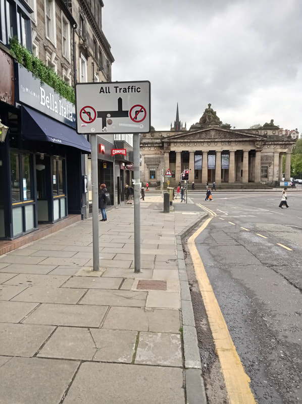
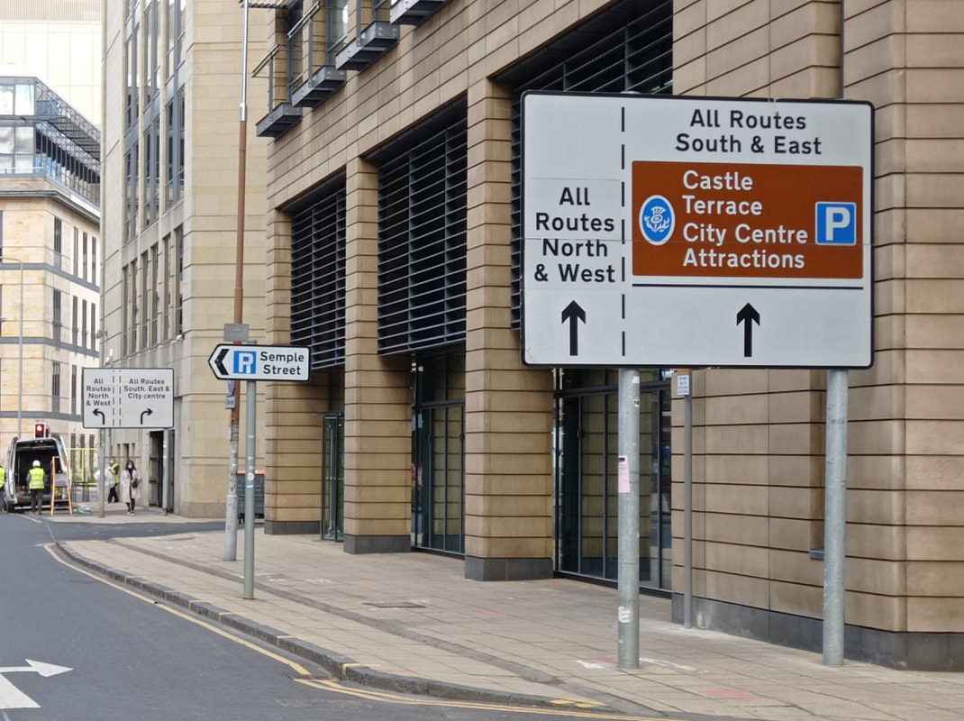
A common sign is the one which basically says ‘straight on’. While there is probably a need for the no left/right turn signs close to the junction, how can these two adjacent signs this size be justified on a busy Hanover Street, right in the centre of a UNESCO world heritage site no less?
 RSS Feed
